Can we help?
Please get in touch by phone or email
+44 (0) 2079 686 871
Call Us
DELIVERY TO A DIFFERENT LOCATION?
You are currently in the United Kingdom store.
If you want to deliver to another destination, you will need to select your desired local market website below.
Please be aware that products in your Shopping Bag, currency and delivery are subject to changes.
Choose your local market website:
Proceed to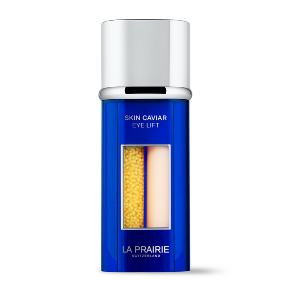
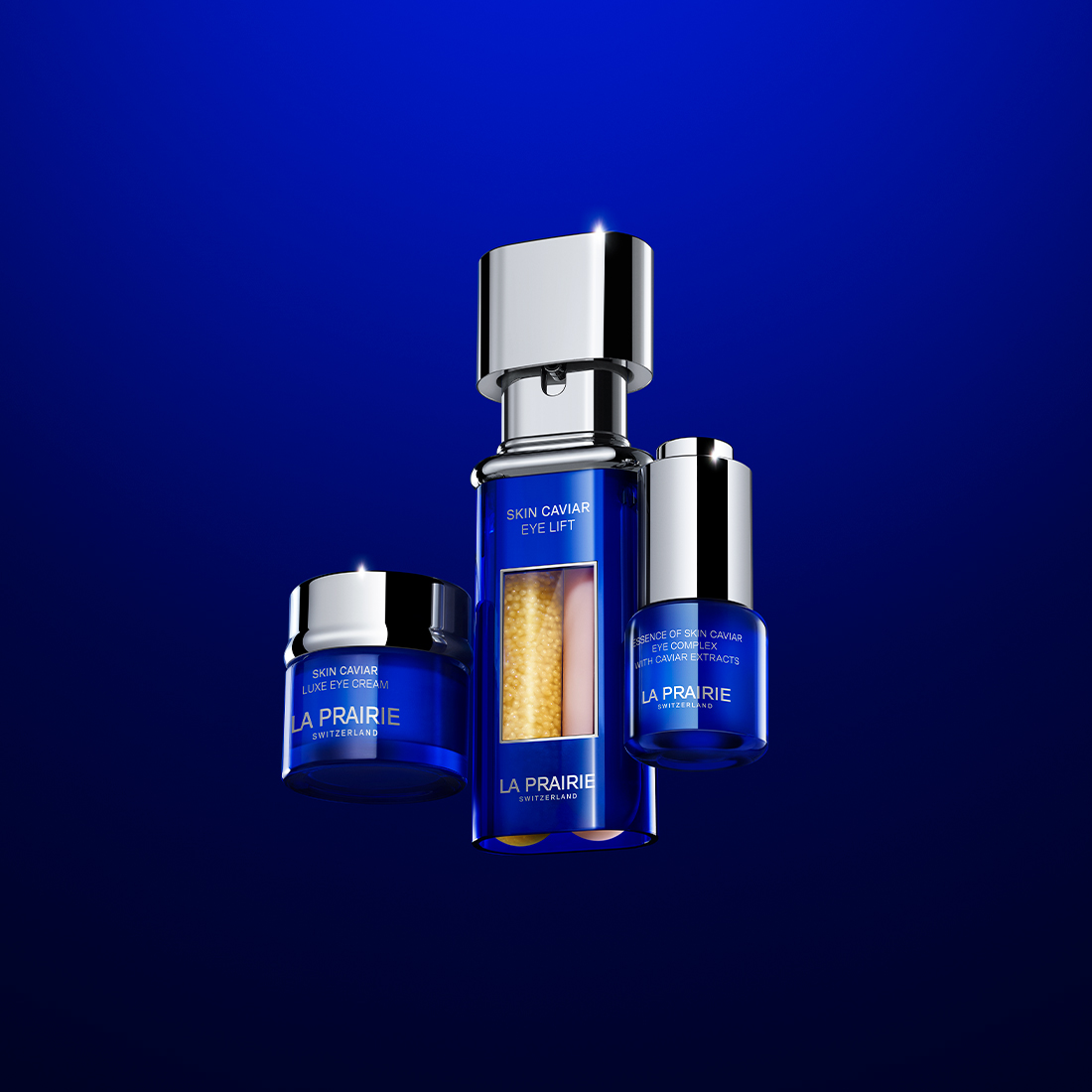
SKIN CAVIAR
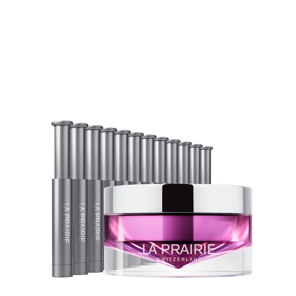
EYE LIFT
LIFTING AND FIRMING EYE SERUM
PLATINUM RARE
HAUTE-REJUVENATION MASK
REJUVENATING TWO-STEP NIGHT TREATMENT
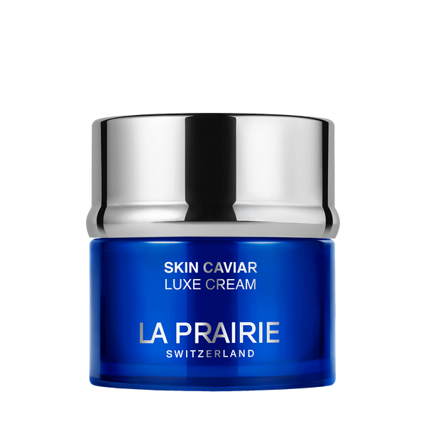
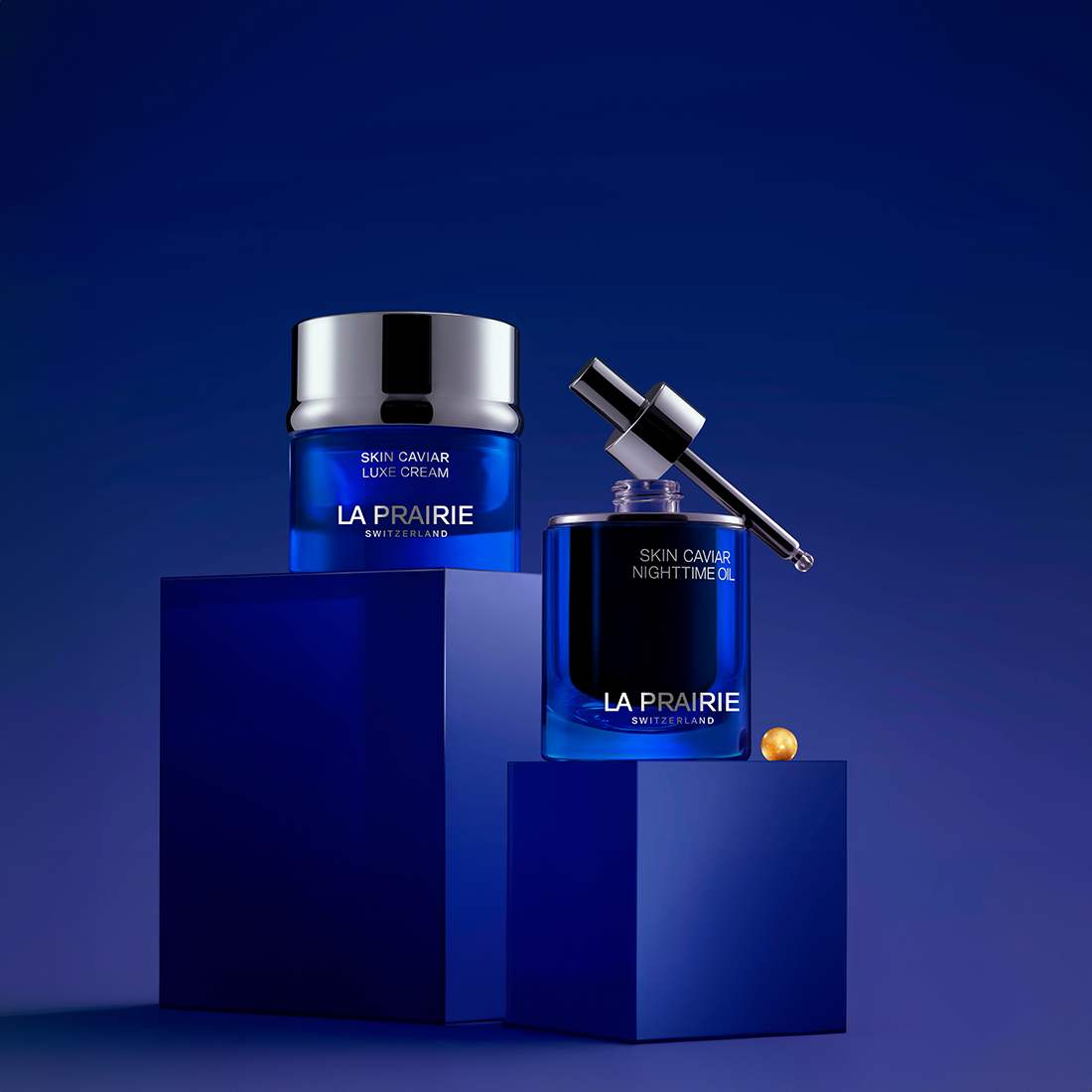
SKIN CAVIAR
LUXE CREAM
RICH AND VELVETY FACE CREAM
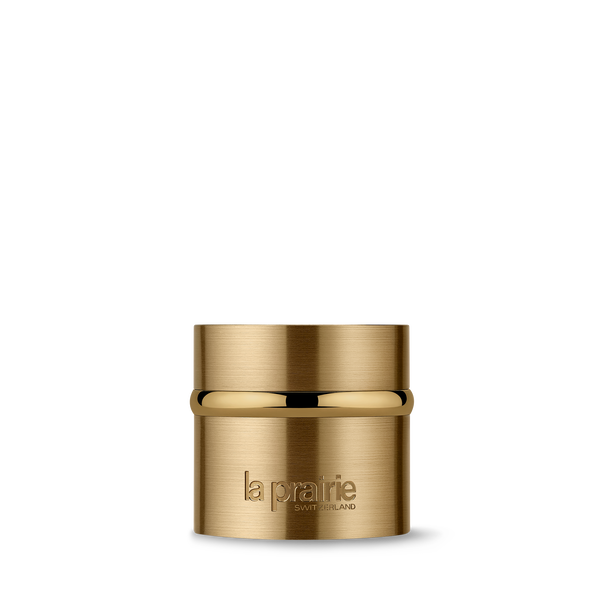
PURE GOLD
RADIANCE CREAM
REVITALISING MOISTURISING CREAM
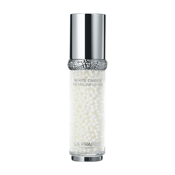
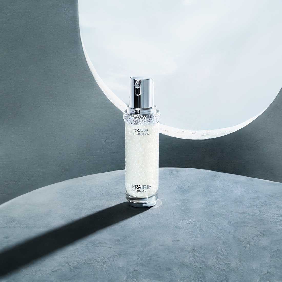
WHITE CAVIAR
PEARL INFUSION
ILLUMINATING AND FIRMING LIGHT-INFUSED FACE SERUM
Receive your purchase in a timely manner, thanks to our premium carrier UPS.
E-Boutique Services
Receive with every order a bespoke skincare ritual of deluxe samples, among a selection of our latest innovations and iconic creations.
Complimentary samples
Our expert Beauty Advisors provide personalised guidance in selecting the ideal rituals for your skin’s needs.
Make an appointment
Please go to your browser settings and enable geo-location to search a store using your current location